Elements
Elements are the building blocks of a screen. Add them by dragging from the Elements Toolbox onto the canvas.
Heading
Section titled “Heading”Displays a title with optional supporting text. Use it to introduce a screen or a section within a screen.

Displays a paragraph of body text. Supports size and alignment options.

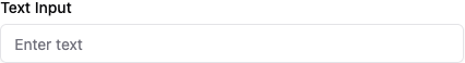
A single-line text field. Supports placeholder text, a default value, and several input types (text, email, password, URL).
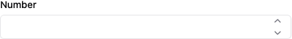
Number Input
Section titled “Number Input”A numeric field. Accepts optional minimum and maximum constraints.
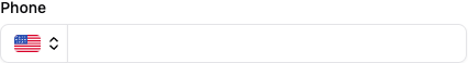
Phone Number
Section titled “Phone Number”A text field formatted for phone number entry.
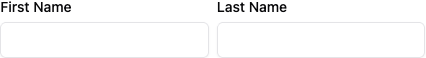
A composite field that renders First Name and Last Name inputs side by side. The two inputs are submitted as separate values.
Select
Section titled “Select”A dropdown that presents a fixed list of options. Set the available options in the Settings Section.

Checkbox
Section titled “Checkbox”A single boolean toggle with a label. The value submitted is true or false.

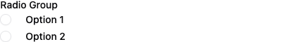
Radio Group
Section titled “Radio Group”A single-select list rendered as stacked radio buttons. Define the options in the Settings Section.
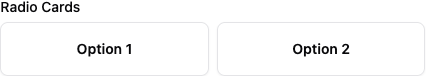
Radio Cards
Section titled “Radio Cards”A single-select field rendered as clickable cards. Supports horizontal or vertical layout. Define the options in the Settings Section.
Displays an image inline. Accepts a URL, width, and horizontal alignment.

Separator
Section titled “Separator”A horizontal rule. Use it to visually divide sections of a screen.

Spacer
Section titled “Spacer”An invisible block that adds vertical space between elements. Height is configurable.

Button
Section titled “Button”An action button. Set Button Type to Submit to advance the form when clicked. A screen must contain at least one Submit button to have an outgoing connection in the layout.
